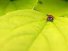
Support. The sharpness and the colors are really good, even at full scale. Bravo! CyrilB 19:26, 28 June 2006 (UTC)Reply[reply]
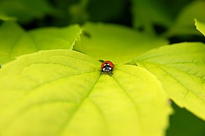
edit: I support the original version. I like this green, the image is very dynamic, and I can't help seeing a skull (the head of the insect) on the cropped version. I agree it is also on the original version, but the small size of the subject mades it less obvious CyrilB 21:31, 2 July 2006 (UTC)Reply[reply]
Support well done norro 21:06, 28 June 2006 (UTC)Reply[reply]
Neutral - not really sure I see the value of it. At full scale, you have to scroll all over the place to find the insect; at screen size it is too tiny to be useful. - MPF 21:08, 28 June 2006 (UTC)Reply[reply]
Support great composition. great quality --AngMoKio 21:23, 28 June 2006 (UTC)Reply[reply]
OpposeSs181292 08:01, 29 June 2006 (UTC) - needs cropping, subject too small. Just crop off the out of focus parts.Reply[reply]
Support This is a graphic image, the main element is color. The "out of focus" or DOF works nice, as it leads the view into the main subject and falls off behind. The lady bug in point of interest. I support the cropped version. --Tomascastelazo 14:40, 29 June 2006 (UTC)Reply[reply]
Support the original version. Very nice colors. Dark green missing in the edit : other colors are less attractive - Ithilsul 14:11, 03 July 2006 (UTC+2)
Oppose center composition doen't fit subject very well, it's also kind of lost in the picture --che 23:54, 11 July 2006 (UTC)Reply[reply]
Support both. Cant decide, in the edit the placement of the insect is more pleasing, in the original I like the dark greens. --Wikimol 08:42, 12 July 2006 (UTC)Reply[reply]
Oppose causes are mentioned above. --Olei 12:09, 13 July 2006 (UTC)Reply[reply]
Voting ended on 18:58, 13 July 2006 (UTC) votes after this time are invalid

 Info created by Luc Viatour - uploaded by Luc Viatour - nominated by Luc Viatour
 Support --Luc Viatour 18:58, 28 June 2006 (UTC)
 Neutral - not really sure I see the value of it. At full scale, you have to scroll all over the place to find the insect; at screen size it is too tiny to be useful. - MPF 21:08, 28 June 2006 (UTC)
 Oppose Ss181292 08:01, 29 June 2006 (UTC) - needs cropping, subject too small. Just crop off the out of focus parts.